The past few months at Dropcountr consisted of working with utility partners and customers from California to Florida, evaluating a new approach to the way we display water usage to our end users. Usage, units, dates and timeframes – it can be confusing! Shoot, that’s why we started Dropcountr in the first place!
We’ve built out dozens of mocks, modifying in small and bold ways how we present information in a way that is digestible and actionable by you, the user. You’ll note changes and additions to the HOME app fall into three distinct buckets:
1) greater ease-of-use
2) contextual information, and
3) action-driven design.
We’re thrilled to share some of our findings and encourage constructive feedback by emailing us at hello@dropcountr.com
VIEWS
How you digest your usage over given periods of time is critical to doing something about it.. You’ll note that – for utilities supporting hourly reads – we removed the “week” view. Our goal here help you identify usage patterns from a macro perspective. Not only is your usage for a given time period front-and-center at the top of the screen, but also your goal. Are you over or under? By how much?
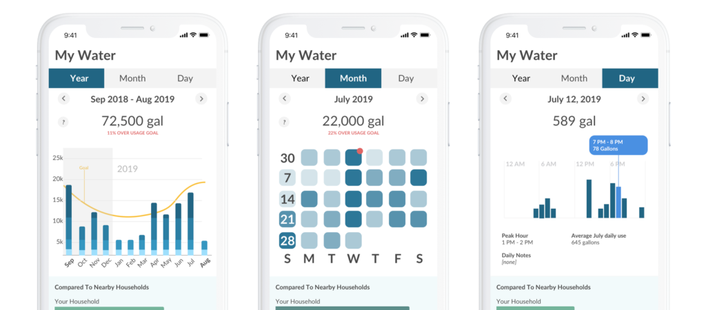
YEAR
We’ve migrated from displaying 6 months to 12, giving you the full picture of your usage. This change was a long time coming and we appreciate your patience
MONTH
The month view has been designed to help you identify patterns and anomalous usage. Your usage for each day are colored to illustrate your relative daily usage throughout the month. Darker colors represent your heavy usage days, and lighter colors your low usage days.
For example, if you average 150 gallons per day (4,500 gallons per month), a day where you used 350 gallons may be dark, and a day when you used 50 gallons may be light. Should you notice a regular pattern of dark Tuesdays, it’s possible your irrigation controller is scheduled for Tuesdays and you didn’t know!
Also, days with a red notch suggest the start of possible leaks and can help you pinpoint where the issue is (“we had construction workers that week, it’s possible they hit a pipe”).
DAY
Your daily usage view was very much inspired by the iOS Screentime application, and can help you identify how much you’re averaging on a daily basis, as well as what hours of the day you’re using the most water.
Modals
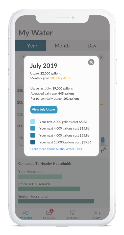
Consolidating your usage and relevant information to a single screen was our priority. The data points you’re familiar with like tier information and how much you used last year are still present, but we’ve also added your averaged daily use for a given month and your per capita usage.
“There’s no way I use this much water” – we’ve heard this many times! When you look at your consumption from a monthly view, 7,000 gallons sounds like a LOT. But it starts to make sense when you drill down to how many people in your household are using water on a daily basis.
For example, if you used 7,000 gallons in July, but you have 4 people in your household, that averages out to about 60 gallons per person per day. Which isn’t nothing – that adds up – but it’s not as daunting as reading 7,000 gallons on your bill.
Thresholds
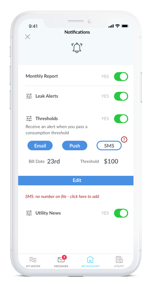
We’ve been looking forward to releasing threshold alerts for a long time, and are thrilled to finally release it to our smart-meter supported users. Thresholds alerts are set to give you a heads up when your usage exceeds a certain dollar amount on your monthly bill.
Perhaps you want to keep your usage down to $50 per month, perhaps you have $150 budgeted for it. Dropcountr will soon give you a heads up when you’ve exceeded that amount, so that you can throttle your usage if needed (and so that you’re not surprised when you receive your next bill!).
My utility
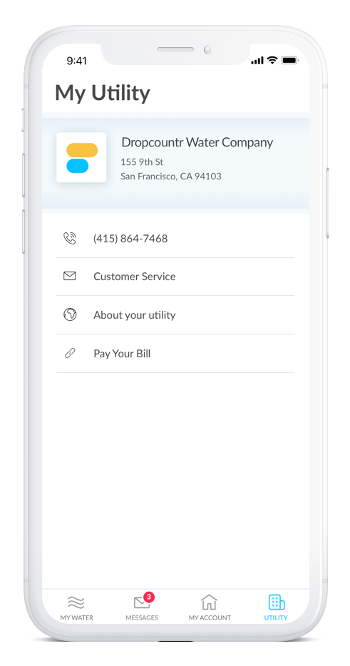
The final big request we heard from users was additional ways to navigate and communicate with their utility in the app. The goal here was to consolidate all the actions you may take on the utility website in the app and device you use every day.
Need to call customer service? Need to pay your bill? Want more information about your utility and the service area they serve? All this and more can be found in the My Utility page.
In Conclusion
Thank you again to everyone who participated – your feedback will help thousands of residents nationwide understand and manage their water use in smart and efficient ways.
We’d also like to welcome some of our new partners to the Dropcountr family – the City of Punta Gorda in Florida, the City of Santa Barbara in California, and the City of Hewitt in Texas.
We very much look forward to sharing these updates and appreciate your feedback – please send us a note at hello@dropcountr.com if you’d like to discuss further.
💦- Team Dropcountr